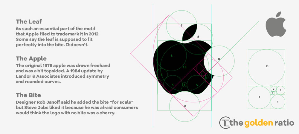
In the bustling world of technology, where symbols often carry profound meanings, Apple’s iconic bitten apple logo has been the subject of numerous interpretations. Some enthusiasts draw parallels to the biblical tale of Adam and Eve, suggesting the logo symbolizes the pursuit of forbidden knowledge. Others believe it’s a tribute to Sir Isaac Newton’s revolutionary discovery of gravity under an apple tree. A prevalent theory among tech aficionados is that the ‘bite’ is a clever pun on the term ‘byte,’ a fundamental unit of digital information.

However, the true story behind this emblem is refreshingly straightforward. Rob Janoff the graphic designer who conceived the Apple logo in 1977, recently addressed these myths in an interview with Creative Bits. Janoff explained that the bite was incorporated for a practical purpose: to ensure the fruit was unmistakably recognized as an apple, preventing any confusion with other round fruits like cherries or peaches. This design choice provided a sense of scale and clarity, making the logo easily identifiable.
Janoff expressed amusement at the various interpretations that have emerged over the years, noting that while they are imaginative, they weren’t part of his original design intention. His primary goal was to create a clean, simple logo that would resonate with consumers and stand the test of time.
This revelation underscores the power of minimalist design. Sometimes, the most enduring symbols arise from straightforward intentions, and it’s the audience that imbues them with deeper meanings over time. Apple’s logo serves as a testament to how a simple design can evolve into a cultural icon, inspiring stories and interpretations far beyond its original conception.
The Evolution of Apple’s Iconic Logo
From its humble beginnings in 1977 to becoming one of the most recognizable symbols in the world, Apple’s logo has undergone a fascinating transformation. Designed by Rob Janoff, the original rainbow-colored apple symbolized creativity and innovation. Over the years, it has evolved into the sleek, minimalistic monochrome version we see today—yet its essence remains unchanged: a mark of simplicity, elegance, and cutting-edge technology.
Here’s a look at the journey of Apple’s iconic logo:

This decision marked the beginning of Apple’s visual identity, one that would evolve alongside the company’s groundbreaking innovations. Over the years, the logo transitioned from its rainbow-striped version to sleeker monochrome designs, reflecting Apple’s shift toward minimalism and sophistication. Yet, despite these changes, the essence of the logo remained intact—a symbol of creativity, knowledge, and technological revolution.
From the Apple II to the latest iPhones and MacBooks, the bitten apple continues to be more than just a logo; it’s an emblem of innovation that resonates with millions worldwide. And to think—it all started with a simple yet brilliant design choice made back in 1977.


