


In a world driven by pixels and perception, even the tiniest design tweak can speak volumes — and Google just proved that.
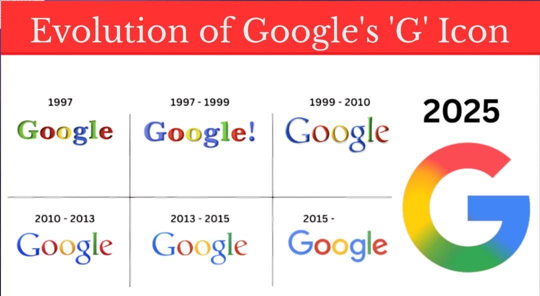
After nearly a decade of visual consistency, Google has quietly refreshed its iconic ‘G’ logo. The update ditches the solid, primary-colored blocks we’ve all grown used to and introduces a sleek gradient that subtly blends red, blue, yellow, and green in a smoother, more modern transition
So… What’s New?
If you’ve spotted something slightly different on your app dock, you’re not imagining things. Google’s new ‘G’ looks familiar but feels fresher.
![]()
-
Old Version: Solid blocks of four primary colours
-
New Version: A gradient effect that softly merges the colours
-
Why? It’s more in tune with Google’s evolving brand, especially its big leap into AI
The change is currently visible to iOS users via the Google Search app and has begun popping up on Android devices through the Google app beta version 16.18.
The shift may seem minor, especially at smaller sizes, but it’s a strong design cue that Google’s brand is entering a new era — one powered by artificial intelligence and fluid design language.
🧬 The AI Connection: Gemini Leads the Way
![]()
This makeover doesn’t come out of the blue (well, maybe a little blue-to-purple gradient). Google’s AI-powered assistant, Gemini, already introduced a gradient-style logo, signaling this shift months ago.
And now, with AI becoming the beating heart of every Google product, the updated ‘G’ logo is likely the first step in a larger visual rebrand.
🅶 What About the Wordmark?
The iconic Google wordmark — the one that greets us on search pages every day — remains untouched. And for now, there’s no confirmation on whether services like Chrome, Maps, or Drive will adopt similar design upgrades.
But here’s a hint: If Gemini is the blueprint, expect more gradients in your Google future.
📱 Where Can You See the New ‘G’?
-
✅ Live now: iOS devices via the Google Search app
-
✅ Rolling out: Android (Google app beta users)
-
🔜 Coming soon: Other platforms and devices in the weeks ahead
This isn’t just a cosmetic tweak. It’s Google signaling evolution — from search engine to AI powerhouse, from sharp colors to subtle gradients, from static icons to dynamic identities.
A new ‘G’ for a new Google.